

Client Case Study * July 2023
Descent Magazine
Implementing a responsive desktop and mobile website for the University of Southern California's APISA arts collective

Refreshed Descent's original digital branding, resulting in a modern website to attract prospective students for Fall 2023 executive board recruitment.

Gained one new brand partnership for Descent within a single week of launching the website.

Streamlined an outdated 11-item navigation into seven concise and centralized pages (with responsive design) for enhanced user experience.
MENU
Achievements
AT A GLANCE
Client
Descent Magazine
Application
Website (Desktop and Mobile)
Role
UI/UX and Brand Designer
(Solo Project)
Toolbox
Figma
Adobe Illustrator
Squarespace Fluid Engine
Timeframe
July 2023
Overview
Descent Magazine is as a literary and arts publication which serves Asian Pacific Islander and South Asian (APISA) creatives at the University of Southern California (USC). Their current website utilizes a default template and focuses on housing their five digital publications. However, Descent is ready to expand their internal team and build external partnerships. Descent aims to reposition itself as a dynamic collective rather than a static publication.
Their new website will target University of Southern California students and APISA creatives external to USC.
Identify
Roles and Responsibilities
As the solo UI/UX Designer on this project, I collaborated remotely with Descent’s Writing Editor and Director of Multimedia to understand Descent's goals and provide regular project updates. I led the end-to-end development of their new website, completely restructuring its information architecture and establishing a new visual identity for Descent.
Constraints
To ensure that members without web design experience could continue to make edits to the site, I opted to keep the project on Squarespace.
THE PROBLEM
How might we transform the Descent Magazine website into a user-friendly culture hub for viewers and prospective partners?
Empathize
Stakeholder Interviews
With support from Descent editors, I conducted generative research with a 30-minute focus group of ten general members in Descent. Here’s what I learned:
Preferences
-
Preserving Brand Identity: Older members appreciated the unique, artistic character of the current website because it reflected their origins as a small zine. They believed the Descent website should differentiate itself from minimalist, editorial magazine websites.
-
Emphasis on Advocacy: Descent was founded as a creative and activist outlet for APISA students during the peak of COVID-19-related anti-Asian violence. Descent members wanted to spotlight advocacy on their website.
Pain Points
-
Difficult to Update: On the current Descent Website, it was difficult for users on the backend to keep track of and update important information on the website in a timely manner.
-
Lack of Community: Despite the basic information on the website, they expressed that Descent felt more like a publication rather than a living, collective group of people.

Organization Goals for Fall 2023
-
Strengthen Relationships: Descent hoped to expand internal membership and establish partnerships with external Asian American creative organizations.
Understanding Descent's Target Users
Descent's target audience is Asian American students and entrepreneurs, ages 18-25.
I conducted four 30-minute interviews with three USC students and one Asian American creative entrepreneur to gather insights on their creative goals and motivations. All users had no affiliation with Descent.
Based on my interview insights, I summarized Descent's user base into two personas:
.png)

Reframe
I synthesized my research with all three stakeholders (current members, applicants, and future partners) into insights.
Taking that a step further, I broke down these insights into key design goals and "How Can We" statements to focus on while building my designs.
DESIGN GOAL #1
Update the visual identity of the site to attract new partners and collaborators, while appealing to the nostalgia of legacy Descent members.
Supporting Insight: Current Descent members want its historical roots to shine through in the website, but target users prefer a simplified, convenient website that shows the organization can grow with current creative trends.
KPIS: Bounce rate, feedback from current members
DESIGN GOAL #2
Redesign information architecture and website copy to highlight the core mission, values, and people who power Descent.
Supporting Insight: Student applicants and potential partners may lose interest in becoming involved in Descent if relevant information is not presented at convenient times.
KPIS: Time spent on the “About Us” page
DESIGN GOAL #3
Enhance information architecture to guide users effectively in getting involved with Descent.
Supporting Insight: Student applicants and potential partners may lose interest in becoming involved in Descent if relevant information is not presented at convenient times.
KPIS: Conversion rate on CTA buttons, applicant rate
REFRAME: HOW CAN WE STATEMENTS
How can we create an immersive, cohesive visual experience for first time visitors while still appealing to return readers and members?
How can we highlight the most relevant information to respective user groups?
How can we invite new visitors to reach out to Descent?
Ideate
PART 1: INFORMATION ARCHITECTURE
I conducted an audit of the current website’s information architecture, focusing on the content structure and the navigation system. After constructing a site map, I discovered the following pain points:
-
Unclear navigation items: External members and partners may find it difficult to understand certain terms like "Theme" on the website or differentiate between "Read" versus "Issues." Content buckets are not intuitive, which could have been improved through a card sorting exercise.
-
Heavy cognitive load: There are 11 menu items, yet convenience is a strong motivator for both personas. Too many options can prevent users from finding relevant information and getting involved.
-
Inconsistent content: Content was inconsistently updated across pages, leading to conflicting and redundant information in different sections. Administrators also struggled to decide the appropriate placement of content.
-
Missing critical information and CTAs: The majority of pages lacked a CTA, including the landing page. This lack of clear direction for convenience-driven users likely cost Descent applicants and creative partners.
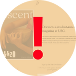
Original Descent Website (Homepage)

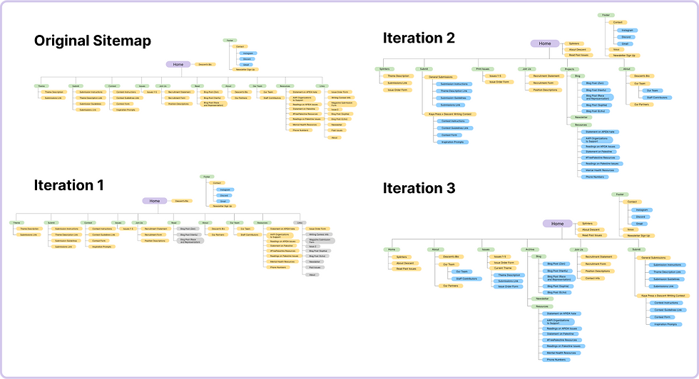
Considering how these prominent UX issues intersected with my design goals, I developed five new site map iterations that archived deprecated content and consolidated the top navigation to seven menu items.
.png)
As visually reflected in my sitemap progression, I focused on transitioning the original horizontal site structure to a more vertical one.
.png)
To test out my redesign, I developed a user flow that someone might take to find out how they can join Descent and compared it to the original user flow. The path was more streamlined and reduced room for user error.
.png)
PART 2: VISUAL BRANDING
-
Colors: I maintained brand integrity by incorporating similar colors to the original Descent website. However, I found the current palette too dark and formal. So, I opted for more vibrant reds and lighter beiges to evoke an open and approachable atmosphere.
-
Typography: I replaced Squarespace's default mix of typefaces with a contemporary sans serif typeface for the header and a grotesque typeface for the body text, achieving a organic, human feel.
-
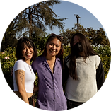
Imagery: I increased the number of images featuring the Descent team and their previous work. I avoided generic stock images and instead utilized assets generated by Descent to visually highlight the vibrant community and culture that defines the essence of the organization.
Moodboard


Iterate & Build
Initial Wireframes

I translated my sitemaps and visual concepts into low and mid fidelity wireframes on Figma. I honed in on the landing page, focusing on creating an immersive experience that presented key information about what Descent is and how people can get involved with Descent. I created various high fidelity wireframes and mockups of the landing page because I felt that this page was most crucial to achieving our design goals.
Lessons from Initial User Testing
The primary feedback I received was that my landing page wireframes were acceptable but forgettable. I needed to push my designs further while improving the site's overall visual organization.

Mockups and User Testing (Again)
Taking initial feedback into account, I incorporated playful visual elements that mimic the "creative scrapbook" feel of the old website. Key elements included:
-
Overlapping text with images
-
Scrolling text banners
-
Floating shapes and symbols

Agile Implementation
To streamline the process and meet our tight schedule, I skipped creating a full set of pages and prototyping on Figma due to uncertainties about Squarespace's capabilities. I instead opted to fast-track implementation, allowing the Descent team to begin adding essential recruitment information.
I also noticed that some planned content in the final site map was either outdated or not yet available. To focus on recruitment and Descent's mission, I removed irrelevant pages and optimized the navigation bar accordingly.
Outcomes & Reflection
Within a week of the website going live and reaching out to brand partners, Descent secured a future Fall 2023 collaboration with an Asian American fashion company with over 14,000 followers on Instagram. Internal members from the Design Team, Writing Team, Communications Team, and Executive Board gave unanimous positive feedback on the visual branding.
EXPERIENCE THE WEBSITE
PRODUCT SCREENSHOTS
You can also access the website at descentusc.com or view the product screenshots through Figma.
Key Takeaways
Maintain an agile design process and understand which goals to prioritize. While implementing my designs on Squarespace, I realized that my Figma mockups prevented responsive design for web and mobile. So I redesigned the site directly on Squarespace through trial-and-error and custom CSS.
I prioritized enhancing information architecture to encourage user involvement, giving precedence to mobile UX over creating an extremely artistically unconventional website.